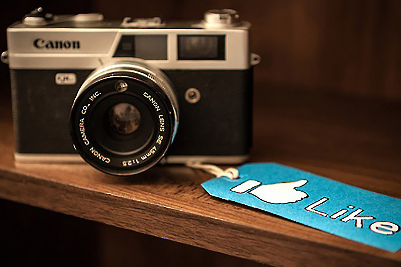
In Facebook ads, the picture is flat out more important than the text. Perhaps 80 percent of the click-effectiveness of your ad will be determined by the image you choose and the headline you provide for that image, with 70 percent coming from the image alone.
When you’re thinking about images on your ads, the question to ask yourself is, “How can I get the user to not merely notice my ad and click for pure curiosity’s sake, but be compelled to click on it and take the next action I’ve planned for them after they click?”
The following tips will help.
1. Use in-action photos. Photos (or a still frame of a video) where you or your product are in action are great images for news feed ads. They’re authentic, they stand out, and they’re typically very congruent with your landing page. In-action photos can be of you, of your product, your typical customer or any type of in-action you can think of.
2. Use pictures of people. Facebook is all about people, so look for images that include pictures of people. Pictures of people are the backbone and lifeblood of Facebook, and they make great images to include in your ad campaigns.
Selling to moms? Test pictures of kids. Cute kids, dirty kids, happy kids, and what else? We hope you said “crying or screaming kids.” Pictures of crying and screaming kids evoke a strong emotional reaction that interrupts.
If you’re looking at lots of pictures of kids, the crying kids are just like green eggs and ham—you spot them a mile away. Every mom immediately relates to a crying kid:
“Yes, please, help me get this kid to stop crying!”
It’s also critical to determine where the people in the image are looking. If you walk into a crowded room and look around at all the people, who do you think you’re more likely to notice?
A person looking at her friend
A person looking directly at you
Of course, you’ll notice the person looking directly at you. It’s a primal response.
Deep inside of your head your brain sees a person looking directly at you as a possible threat or love interest—both get your attention. All things being equal, images of people are more effective at interrupting when they’re looking directly at you.
3. Use pictures of things. If about half of the ads in Facebook use pictures of people, the other half include pictures of things. Selling mortgages? Test a picture of a house. Selling cameras? Test a picture of the camera. Selling car insurance? Test a picture of a wrecked car. Selling pizza? Test a picture of a mouth-watering piece of pizza. Selling jewelry? Sell romance. Selling cat products? Test a picture of a cat. Or, better yet, test a picture of a kitten, too.
We can think of a million more ideas for images. Test lots and lots of different images of what you’re selling. This seems perhaps a bit too easy, but the reason it works is simple. If you’re advertising tires for a local tire store, post a picture of a tire. In your community, somebody needs to buy tires for his or her car, right?
When this person sees the tire ad, they’re actually interrupted by the image of a tire. Why? Because they’re already spending some mental energy thinking about the need to buy tires soon. The tire image triggers these individuals.
4. Include pictures with words. Facebook lets you include text in images, which adds a new dimension to your ad. Done properly, text in the image box will be much more visually powerful than the headline—meaning it will be read first.
5. Use pictures of words. A powerful technique you should test is simply making your entire image a word that’s a trigger word for your target audience. What are some examples of making your entire image a word? A language tool has as its image the words, “LEARN FRENCH.” A movie theater has as its image the word, “CINEMA.” A local cupcake shop has as its image the words, “HEY Cupcake!”
How many times have you driven by a highway billboard that interested you—but it was so crammed with text you couldn’t read it? Facebook images are micro-billboards. If you use text in your images, take a long, hard look at the image text and ask yourself “Is this easily readable?”
If it’s not, go back to the drawing board and start again. If a word image works well for your business, continually changing its color, background and framing helps prevent ad fatigue.
6. Include strange or silly images. The goal is attention, so don’t be afraid to try strange or silly images. Be the shiny new object—the most interesting thing on the page. Groupon once ran an ad with an image of a little piglet in red rain boots standing in the mud. You couldn’t help but want to click on the little pig — it’s adorable. Ads that fall into this category tend to fatigue more slowly.
Resources: ExpertOnline360.com
